The Role of Color in Restaurant Interior Design
[column width=”1/1″ last=”true” title=”” title_type=”single” animation=”none” implicit=”true”]
The fact that the colour of the surroundings affects the appetite is well known to restaurateurs and interior designers. Choosing the colours of the interior is a necessary step in creating the character of the restaurant. Thanks to the colour palette, you can optically modify the proportions of the rooms, show the good and hide the weaknesses, or mark the functional zones of the restaurant. Colours also affect the psychological sphere of the client, which translate into his feelings, decisions and opinions.
How Restaurant Color Schemes Affect Your Customers
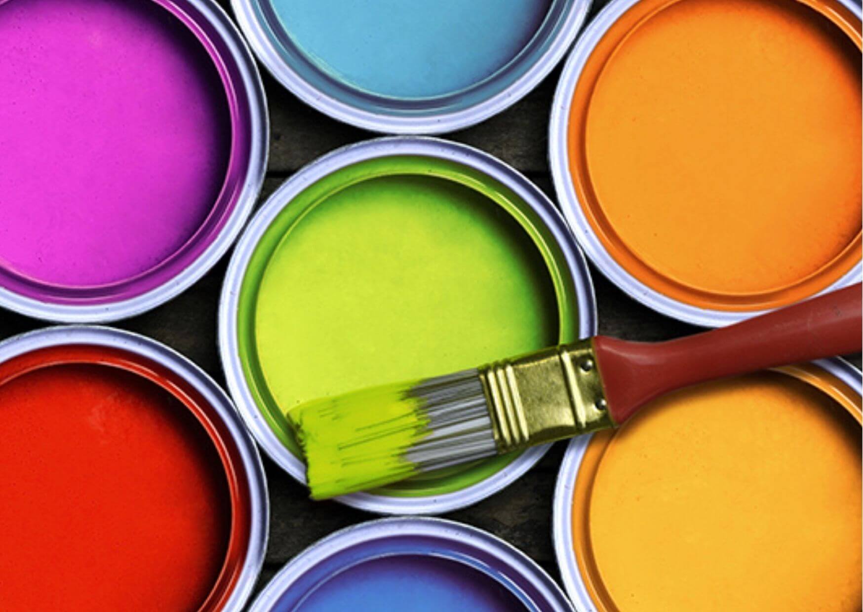
Colours are visible electromagnetic waves, and each of them causes specific psychophysical reactions in people. Colour psychology deals with the relationship between colour, mood and human behaviour. This knowledge has practical application in interior design and restaurant marketing. Suitable colours will allow you to create a place frequently visited by customers and create a strong brand. According to research, up to 90% of customers’ immediate purchasing decisions is related to colour. Therefore, choosing a colour scheme to represent your restaurant’s brand is a declaration regarding its characteristics. Customers will react positively to the restaurant’s décor if the colour of the interior resonates with them appropriately and represents the benefits they expect. Learn the psychology of individual colours and consciously influence the message that will reach potential customers.
Yellow is the brightest colour in the visible spectrum and attracts attention the fastest. The human brain is programmed to perceive this colour first. Yellow is most often associated with optimism, warmth, youth and self-confidence. It provokes action, but its excess can cause anxiety, nervousness and a tendency to criticize. Yellow is great for brands aimed at children. It awakens the taste buds and stimulates the appetite. Therefore, it is often the leading colour in various types of fast food.
Orange is a colour like no other controversial. Very energetic, lively, bold, some people perceive it as cheesy. Usually, customers either love it or hate it. Enthusiasts consider orange as a colour that promises openness, fun and adventure. It is perfect for young people. It suggests a restaurant that is affordable for everyone but of sufficiently high quality. The orange colour usually increases sales in restaurants, cafes and hotels. It stimulates social interactions, encourages joint activity and spending money.
Red is the most stimulating colour. It speeds up the heart rate, increases appetite, awakens passion and desire. It encourages customers to take action. It’s a colour that works great when you want to force the client to make a decision. It arouses excitement and motivation, but excess can cause anxiety and weariness. Red is the best in promoting food services.
Green is a colour associated with nature, peace, relaxation and growth. It recalls the harmony of the body and mind. Green motivates people to join social groups and satisfies the need to belong. It’s the perfect colour for an environmental brand. It works well in the tourism industry.
Blue is the colour of banks, corporations, medical and technology companies. The food industry should avoid this colour because the food of this tone does not occur in nature. Blue is also associated with mould and spoilage.
Black creates an impression of class, elegance and is associated with authority, strength, seriousness or professionalism. Black also creates an aura of mystery. In excess, it can be intimidating and overwhelming. It is the favourite colour of young people, aged 16-25 looking for their identity. However, an interior design dominated by this colour can make your customers feel overwhelmed and tired. Black is perfect when it comes to accessories. Furniture in this colour fits interestingly with the interior in more vivid, intense colours.
Violet increases people’s sensitivity to beauty, stimulates imagination and innovation. Associated with luxury and wealth was assigned to monarchs. Violet attracts early school children, and it is perfect for a colour palette that promotes products for this age group. Lighter shades of purple are suitable for women. In dark tones, it works much better as a colour of accessories, especially in combination with yellow or gold. Purple with grey and silver also look very original and elegant.
[/column]